Plotting in Python is fast, but default color cycles often produce garish, hard‑to‑read graphics. By tailoring Matplotlib’s palette, data scientists can eliminate visual noise and present insights that actually stick. This guide shows busy professionals how to replace the bland defaults with purposeful hues in minutes, without rewriting existing code.
Understanding the Cost of Color Chaos
Clashing colors do more than look ugly—they obscure trends, trigger visual fatigue, and can mislead stakeholders. A line chart with five series in bright reds, greens, and blues forces the eye to jump rather than follow the data flow. In presentations, audience members often ask for a clearer view before the real story emerges. The problem is systemic: Matplotlib’s plt.rcParams['axes.prop_cycle'] defaults to a preset of eight high‑contrast colors that were designed for print, not for on‑screen dashboards.
Three Fast Customization Paths
Pick the approach that matches your workflow:
- One‑liner palette swap: Import a pre‑made list from
seabornorcolorcetand assign it torcParams. - Named palette definition: Create a dictionary of semantic colors (e.g.,
'success': '#4CAF50', 'warning': '#FF9800') and reference it in each plot call. - Dynamic generation: Use
matplotlib.colors.LinearSegmentedColormapto interpolate between brand‑specific start and end hues.
All three methods keep the rest of your script untouched; they merely adjust the global color cycle before the first plt.plot() call.
Step‑by‑Step: Build a Reusable Palette
- Identify the visual identity you need—corporate brand colors, accessibility‑friendly palettes, or a theme suited for dark mode.
- Collect hex codes in a list, for example:
["#005792", "#F2A900", "#D90429", "#7A9D54"]. - Insert the list into Matplotlib:
import matplotlib.pyplot as plt

plt.rcParams['axes.prop_cycle'] = plt.cycler(color=['#005792', '#F2A900', '#D90429', '#7A9D54'])
From this point forward every plot uses the new sequence, and you can store the snippet in a utils.py module for reuse across projects.
Applying the Palette to Common Plot Types
Here’s how the same palette behaves across three frequent visualizations:
- Line charts: Distinct lines stay legible even when overlapping; muted tones reduce visual competition.
- Bar graphs: Grouped bars inherit the palette, making category comparison straightforward without extra legends.
- Heatmaps: Feed the palette into
cmapto replace the default “viridis” with a brand‑aligned gradient.
Integrating Accessibility Checks
When you customize colors, run a quick contrast audit. The colorspacious library can compute WCAG 2.1 compliance for each pair in your cycle. If any combination falls below a 4.5:1 ratio, swap the offending hue for a more legible alternative. This step adds only seconds to your workflow but guarantees that all viewers, including those with color‑vision deficiencies, receive the same insight.
From Development to Production
In production pipelines—CI/CD for notebooks, automated report generators, or Flask dashboards—centralize the palette in a configuration file (e.g., palette.yaml) and load it at runtime. This decouples visual style from code logic, allowing designers to tweak colors without a developer’s intervention. Version‑control the file to track visual updates alongside data schema changes.
Bottom Line for the Time‑Pressed Analyst
Clashing colors are a solvable nuisance. By setting a custom color cycle once, you gain consistent, brand‑aware, and accessible visuals across every Matplotlib output. The three methods outlined require no more than a single import statement, making the switch practical even on a tight deadline.
Guide: How To Say Have A Nice Day In An Email – YLEAV

Guide: How To Say Have A Nice Day In An Email – YLEAV
Say Please And Thank You Clipart
Say Please And Thank You Clipart
Super - Don't Say Vs Say #fblifestyle #learnenglish | Facebook

Super - Don't Say vs Say #fblifestyle #learnenglish | Facebook
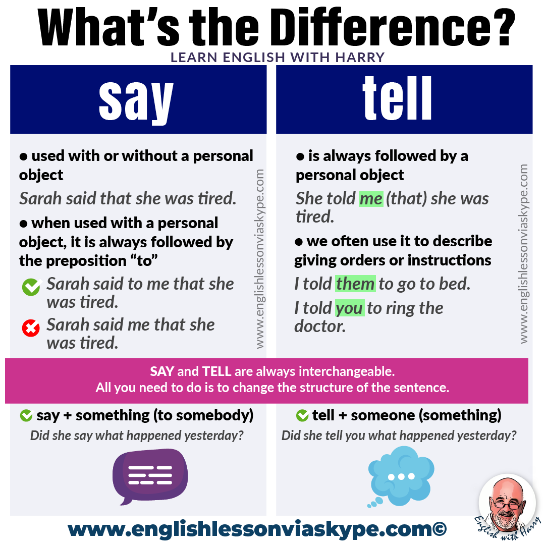
Say Vs Tell Difference - 04

Say Vs Tell Difference - 04
Do They Say Y All In Arizona At Rita Pablo Blog

Do They Say Y All In Arizona at Rita Pablo blog